
Ten
magazine is produced in London and is released 10 times a year(who knew eh),
where most fashion magazines are monthly or bi-annual we can see 10 stands out
from the crowd already. 10 is trying to be unlike any fashion magazine you’ve
read before. The main aim is to focus on quality luxury items. You wont find
high street on the pages of 10 so look elsewhere if that’s what you like.
The
creators say themselves that they aim to define the fashion market by
presenting the industry’s most respected writers, photographers and stylists to
the readers. The magazine wishes to shun the outdated ethos of celebrity
endorsement that is common among other fashion and style magazines and provide
top quality editorial features and photography.
The Cover
The cover features Lady Amanda Harlech
photographed by Cedric Buchet in Chanel. This cover is very different from the
Vogue Paris one. It feels much more edgy than Vogue. The cover image is dark
and stands out. The Model has blue chalk on her hands and the pose is
suggestive, moreover the cover uses suggestive words such as ‘hot’ and ‘pussy’.
The styling its simple again and the make up is little to none, I feel this is
so as to not distract from the blue chalk. The cover paper is thick glossy card, which
makes it feel substantial and expensive. Like Vogue Paris, this cover has very little
text on the front, which again helps it to stand out on the newsstand, the only
text is the ‘10’ logo of the magazine in the top left, then 4 words to quickly describe
the issue and the rest is just information about the issue i.e. number and
price. What I think is interesting is that on the bottom of the cover it says
the model, who photographed it and what she’s wearing, this is something rarely
seen on the front page and really makes it memorable.
The Typography and Graphics
There are 2 main fonts used throughout the
magazine. The first features on the cover and is used for headings. Its bold
and punchy and stands out, its probably a typeface created for the magazine as
it seems to be used consistently throughout. On articles and features with significant
amounts of writing however, another font has been used, a basic serif font
resembling Times New Roman. The text is generally black however sometimes the
text is used on subheadings white on a black backdrop, which makes the text
stand out.
The Layouts
The layout of Ten are also clean and neat
and none of the pages feel overly crowded. The text is generally in one or two columns
depending on how much text there is on the page, and its all aligned right and
not justified. Flicking through the
magazine, the layout seems quite bold and graphic, its edgy and stands out from
the crowd.

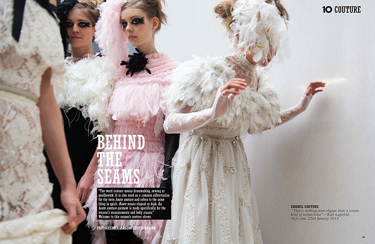
The Editorial
Ten is a very editorial heavy magazine,
most stories are accompanied by a large image and there are plenty of
editorials to feast your eyes on. On editorial is dedicated solely to fashion
week so we can tell this is a magazine filled with luxury fashion. The
photography is all strong and edgy; none of it comes across as whimsical or
romantic. I also found that in a few of the editorials some of the poses used
are quite suggestive. The styling and style of photography is all very graphic
and hard, there’s no soft girly lighting used and even feminine outfits are
sexed up.
The Overall Feel
The overall feel of 10 magazine is very strong,
I feel that they’re trying to stray away from the cliché glossy fashion mag and
they achieve that. The writing is tongue in cheek and the photography is strong
and edgy. Its very striking and exciting which is how fashion publications
should be, the market of fashion magazines is heaving so its important for
titles to stand out to grab attention of the consumer and I think 10 does that
successfully.
No comments:
Post a Comment