Pages - Menu

Showing posts with label Review. Show all posts

Monday, 21 October 2013

Magazine Review: Material Girl


Material Girl is an Austrian women’s fashion magazine that is solely in German so obviously I cant really judge the quality of the writing in the magazine but I will analyze everything else that I can! Material Girl is in a way like Lula however being Austrian has some significant differences. The quality of the magazine feels amazing which works in its advantage amongst more expensive competitors.

The Cover
The first thing you notice about the cover is the paper  (or card even) that has been used, the paper is very heavy and has a metallic sheen to it making it feel very high quality. It also makes the magazine stand out, if it were on a shelf amongst other fashion titles it would definitely grab your attention. The issue in question features an image of a model in an Amish style outfit from Vladimir Karaleev, a pretty unknown designer (perhaps more known in Austria). The image is dark and gives quite a mysterious feel. I like the cover and I like the image used however, although its effective the card used makes the image hard to see. The cover features little else except a small relevant quote in the bottom right had corner.

Typography and Graphics
Since its first issue Material Girl has used the same font for its logos and headings, It is a serif font similar to Times New Roman. Throughout the rest of the magazine the majority of the fonts are more simple sans serif fonts, Material Girl (font wise at least) feels like a watered down version of Lula, its not as obviously girly but also has that whimsical feel.

The Layouts
Like the majority of magazines I’ve looked at here, the layouts used in Material Girl are very clean and minimal. On some features the text is in a circle with the type slanted which I think is quite interesting and something that I haven’t seen used before. The way the imagery is laid out throughout the magazine is also interesting. The use of a clean minimal layout makes a magazine seem more upmarket I think, as its generally glossy magazines such as OK and New which have very busy layouts and you wouldn’t pay more than a couple of pounds for them so a layout tells you a lot abut a magazine.
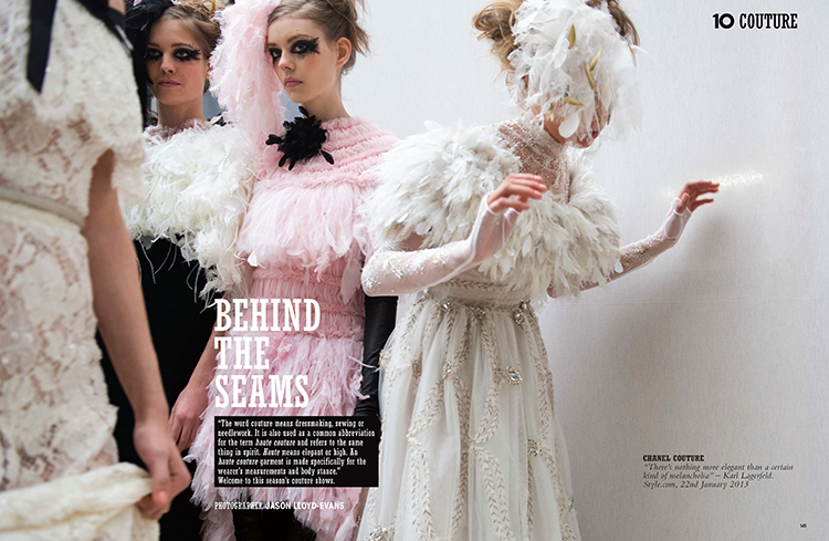
The Editorial 
As far as editorial is concerned, not being able to read German means I will only be able to analyze the imagery! The photos in Material Girl all feel very precious and somewhat darker and deeper than those in Lula. The editorials are short but high in frequency. A couple of the editorials such as the ‘Bridget’ editorial are similar to Lula in the respect that it heavily focuses around pastel light tones and is shot in very soft lighting with a dream like feel. However the editorials all seem quite different which makes Material Girl not such a predictable magazine.

The Overall Feel 
Similar to Lula the overall feel of Material Girls is a very dream like whimsical feel however it seems slightly darker and more mysterious. The magazine is filled with fashion and beautiful imagery that will grab the reader’s attention. 

Magazine Review: Lula Magazine


Lula Magazine is a London based bi-annual fashion magazine created by Leith Clark in 2006. It describes itself as “the kind of girl you'd have a crush on, or be intimidated by. Her style is all old-fashioned cameras, 70's dresses, patterned stockings, and heavy mascara. She'd live in an apartment where the wallpaper is peeling off, but it would be held together lovingly by a litter of poems and polaroid’s”. Lulu has a capricious, mild and ethereal aura – girly clothes and vintage pictorials mixed among interviews that sound like late-night chats between friends. Quite possibly a good investment, since previous issues are selling on e-bay for up to £200.

The Cover
I am looking at issue 14. As with every Lula cover the spine is graced with a delicate necklace, in this instance a piece from Hillier. On the cover is model Kelly Mittendorf, Lula covers generally feature models instead of celebrities and often feature little else except the cover image and the title of the magazine at the top of the page, the alignment varies each issue, in this issue the title is centered. The pose and facial expression of the model is quite seductive but in a subtle way. She is wearing a Nina Ricci dress and the make up is quite heavy with a bright pink lip. The lighting is quite strong, the image is strong and the use of a unusual model makes the cover stand out however there are other Lula covers I prefer compared to this one.

The Typography and Graphics
Over the years the fonts in Lula have changed, however the title font has remained the same since issue number one. The font is a serif font that is custom made for the magazine. The font is feminine, classic and fun much like the magazine. At around issue 11 that was edited by Kate and Laura Muleavy of Rodarte, Lula drastically altered its layouts and the fonts used within the magazine. The fonts most commonly used in the magazine are Silhouette LP and Marian 1812. The latter is a thin and whimsical font, which works really well within the magazine.

The Layouts
Lula magazine is put together by art director Charlotte Heal who also creates layouts for Love magazine. The layouts, like the graphics and typography, go hand in hand with the magazines aesthetic and overall feel. The layouts are clean neat and use plenty of negative space. A lot of the editorials and articles are introduced with a title on a blank white page. The magazine is very dream like and romantic and I feel this is illustrated through the art direction.

The Editorial
Lula is very image heavy but also features a wide range of interviews with people the reader would find interesting, from talented illustrators to cool indie girl bands. The imagery is all very dream like, often using soft natural lighting. In this particular issue there’s an interesting piece on Meadham Kirchhoff and also a piece about some of the shows from SS 12. All the stories and subjects featured in the magazine would interest the target market.

The overall feel
Its obvious just from looking at Lula what Leith Clark is trying to achieve.  Lula strives to be romantic whimsical and girly without being too dainty, its still a magazine that commands attention. It markets itself so well for its consumer and you know what you’re getting just by looking at it

Magazine Review: 10 Magazine


Ten magazine is produced in London and is released 10 times a year(who knew eh), where most fashion magazines are monthly or bi-annual we can see 10 stands out from the crowd already. 10 is trying to be unlike any fashion magazine you’ve read before. The main aim is to focus on quality luxury items. You wont find high street on the pages of 10 so look elsewhere if that’s what you like.
The creators say themselves that they aim to define the fashion market by presenting the industry’s most respected writers, photographers and stylists to the readers. The magazine wishes to shun the outdated ethos of celebrity endorsement that is common among other fashion and style magazines and provide top quality editorial features and photography.

The Cover
The cover features Lady Amanda Harlech photographed by Cedric Buchet in Chanel. This cover is very different from the Vogue Paris one. It feels much more edgy than Vogue. The cover image is dark and stands out. The Model has blue chalk on her hands and the pose is suggestive, moreover the cover uses suggestive words such as ‘hot’ and ‘pussy’. The styling its simple again and the make up is little to none, I feel this is so as to not distract from the blue chalk.  The cover paper is thick glossy card, which makes it feel substantial and expensive. Like Vogue Paris, this cover has very little text on the front, which again helps it to stand out on the newsstand, the only text is the ‘10’ logo of the magazine in the top left, then 4 words to quickly describe the issue and the rest is just information about the issue i.e. number and price. What I think is interesting is that on the bottom of the cover it says the model, who photographed it and what she’s wearing, this is something rarely seen on the front page and really makes it memorable.

The Typography and Graphics
There are 2 main fonts used throughout the magazine. The first features on the cover and is used for headings. Its bold and punchy and stands out, its probably a typeface created for the magazine as it seems to be used consistently throughout.  On articles and features with significant amounts of writing however, another font has been used, a basic serif font resembling Times New Roman. The text is generally black however sometimes the text is used on subheadings white on a black backdrop, which makes the text stand out.

The Layouts
The layout of Ten are also clean and neat and none of the pages feel overly crowded.  The text is generally in one or two columns depending on how much text there is on the page, and its all aligned right and not justified.  Flicking through the magazine, the layout seems quite bold and graphic, its edgy and stands out from the crowd.

The Editorial
Ten is a very editorial heavy magazine, most stories are accompanied by a large image and there are plenty of editorials to feast your eyes on. On editorial is dedicated solely to fashion week so we can tell this is a magazine filled with luxury fashion. The photography is all strong and edgy; none of it comes across as whimsical or romantic. I also found that in a few of the editorials some of the poses used are quite suggestive. The styling and style of photography is all very graphic and hard, there’s no soft girly lighting used and even feminine outfits are sexed up.

The Overall Feel
The overall feel of 10 magazine is very strong, I feel that they’re trying to stray away from the cliché glossy fashion mag and they achieve that. The writing is tongue in cheek and the photography is strong and edgy. Its very striking and exciting which is how fashion publications should be, the market of fashion magazines is heaving so its important for titles to stand out to grab attention of the consumer and I think 10 does that successfully. 

Magazine Review: Vogue Paris

Vogue is one of the most well-known and oldest fashion magazines in the world, with editions in over 20 countries it’s likely you’ll have trouble finding someone who hasn’t heard of Vogue before. Each Vogue differs greatly, depending on who edits it. For example American Vogues cover is most commonly covered with celebrities and Hollywood actresses. UK Vogue is a mix of celebrities (mostly British) and the hottest models of the moment. Paris and Italia Vogue however rarely feature celebrities and are pretty much always covered by models. 

The Cover 
The cover features Doutzen Kroes photographed by David Sims in SS12 Givenchy. The styling and make up and hair is all effortlessly cool and minimalistic. The image is on a plain white backdrop, which also adds to the simplicity. From an image search I can see that most Vogue Paris covers are cleaner and more simplistic than their US and UK alternatives.
There is also little text on the front, very different from the Vogues we see here. Whereas Vogue UK generally has text all over the cover, on this cover its been kept to a minimum on the top left of the page. The text is a simple, eligible serif font in gold and black, introducing 4 of the issues main features. The cover looks simple and elegant and with the white background really stands out on a newsstand as being light and contemporary. 


The Typography and Graphics 
The typography is pretty consistent through the issue, even through every editorial the same serif font is used although sometimes in varying formats and sizes. On the features in the magazine a tall bold sans serif font is used alongside the serif font for added emphasis. This also helps to work with the elegant classic serif font to update it and make it more contemporary and edgy.  Its all very clean and simplistic which is what I love about it. 

The Layouts
In keeping with the rest of the magazine, the layouts are kept simple, uncluttered and clean, without looking too bland. There’s a lot of white space, most features and editorials have white border of about 3cm around the edge. The text is generally kept between either one or two columns, not once in the magazine does it extend 2 columns. Most content text isn’t justified except on small features where text is wrapped around images and one or two features, which uses hyphenation. I feel that the layout is in a way quite similar to Vogue UK however is it much cleaner and sharper, which makes it seem more edgier and cool. 

The Editorial
Something that I found with Paris Vogue is that there seems to be more editorial content and its paced throughout the magazine, whereas in UK Vogue its generally all kept together towards the end of the magazine. Emmanuelle Alt herself styles a few of the editorials and I think that that comes through. In this issue, she styled ‘Attitude’ featuring Arizona Muse and also the ‘Haute Couture editorial. All editorials have either a single page or a double page spread there are no more than 1 photo per page and the layouts are kept classic and simple. What’s interesting is every editorial is different, no two are the same. There doesn’t seem to be a particular style for the photos it depends on the trend that the editorial is trying to illustrate. Seeing as Vogue is a fashion magazine read by many it needs to have a broad theme that can connect with lots of different consumers, I do feel though that the editorials here do some edgier than those found in UK Vogue.

The Overall Feel

The overall feel of the magazine is very sophisticated, chic and clean. I think it’s very different from its counterparts, US and UK Vogue. This Vogue feels –much trendier and chic then the other two, with its sparse layouts and simple typography it’s a very beautiful clean publication.