Pages - Menu

Tuesday 29 October 2013

The Rise of the Fourth Conglomerate


As you may have already noticed, British heritage is big news at the moment. Everyone’s trying to get a little piece of Britain, no one however as much as Li & Fung it would seem. 
When we think of conglomerates we obviously jump straight to the likes of LVMH, however Li & Fung are causing a stir in the industry and are looking to become big news. China is constantly emerging, Li and Fung is a trading empire founded in Hong Kong. William Fung along with his brother Victor Fung are slowly but surely buying up the whole of Savile Row. 
The family already controls Gieves & Hawkes, Hardy Amies and Kent & Curwen and now they have recently purchased Savile row tailor Kilgour, who has dresses a-listers from Daniel Craig to Jude Law. Fung Capital, a venture capital arm of Li & Fung, is said to acquire a third brand from Savile Row within the next six months to form part of its new portfolio called Savile Row Brands. It seems the Far East are really looking in to investing in British Heritage and I feel this may just be the beginning of an Asian take over.

Vivienne Westwood Collaborates with Top Heritage Brands


Legendary (and slightly crazy) British designer Vivienne Westwood has teamed up with 5 quality British brands to create a small collection of mens accessories. British heritage is getting a real push at the moment and this latest collection just emphasizes that. The collection is a celebration of quality, craftsmanship and the brands that pride themselves on being ‘Made in Britain’. One of the most notorious names teaming up with Westwood is prestigious luggage manufacturer Globetrotter. The tartan-lined suitcases come with leather luggage belts and straps in Westwood’s distinct squiggle print, and are finished off with foil embossed luggage tags. The other brands collaborating with Westwood are Gloverall; known for their duffle coats, Lock & Co esteemed London hatters, Johnstons of Elgin known for their quality scarves and Pantherella who produce socks, so keep your eyes open boys for your head to toe Vivienne Westwood fix. The collection will be available from www.viviennewestwood.co.uk from November.  

American Legend Lou Reed Dies Aged 71

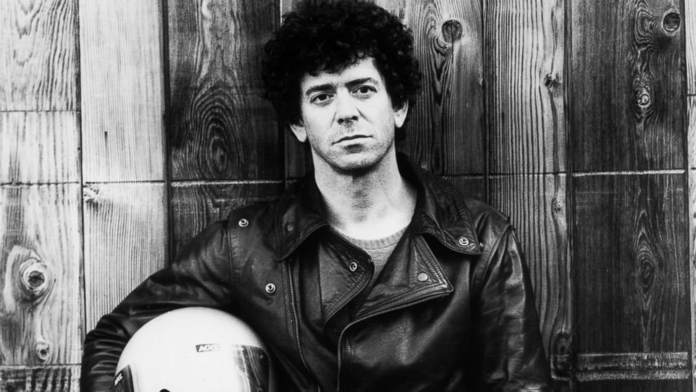
Influential American singer songwriter Lou Reed passed away yesterday aged 71. As the music industry mourns this great loss it seems only right to look back at the work of one of the most significant musicians of our time.
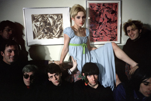
Some of you youngsters may not be aware who Lou Reed was but I bet you recognize this image by American artist Andy Warhol. 
Reed was the founder of The Velvet Underground; a band that although not hugely acclaimed in the sixties has since become one of the most widely cited bands of the era. The Velvet Underground and Lou were part of Andy Warhol’s famous ‘Factory’ scene in New York along the likes of Edie Sedgwick. 
Reed then went on to have a very successful solo career in the 70’s alongside the likes of David Bowie and Iggy Pop. One of his most influential solo albums being the 1972 record Transformer featuring famous track ‘Perfect Day’.

Lou Reed had a powerful effect on music and culture today, the ray ban white shirt leather jacket look that we see at least once every day was pioneered by Reed and seen as challenging and rebellious back in the day but is now just a part of teenage subcultures. 
Reed will be remembered for years to come for both his experimental music and effects on culture, we mourn the loss of an American legend.

Sunday 27 October 2013

Dates For The Diary: London Collections Men

Just an update of dates for your diary, London Collections: Men is back for another season. The event will run from the 6th to the 8th of January 2014, so keep it free! Thats all the info I've got at the minute but keep checking back for details of schedule etc!


How Important is Provenance?

If I asked you where the top your wearing was made could you tell me? Would it be Britain? The likely answer to both questions would be no.
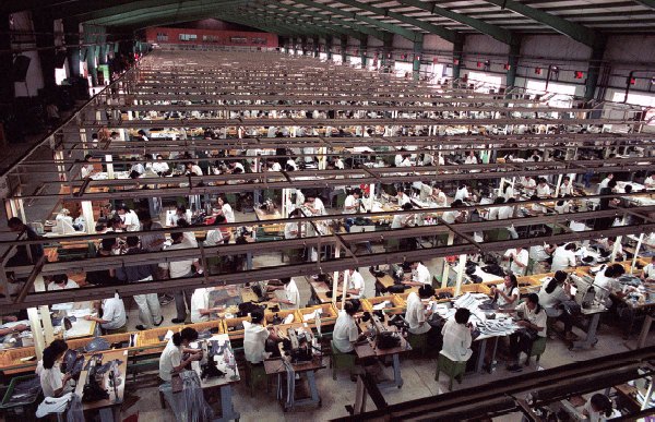
Over recent years we've become so wrapped in up wanting more and more for less and less we've started to forget about the importance of provenance and truly owning something British. The majority of the British high street labels don't produce there garments in the UK as creating garments in the far east, China etc, is much quicker and cheaper than producing garments in the UK.
For some people however, provenance is extremely important and will go out of their way to find garments 100% produced in Britain. This is proving harder and harder nowadays though as garments with as little as the buttons stitched on in the UK are given "Made in Britain" labels. For example, Jack Wills that relies on British heritage as its selling point and describes itself as 'Fabulously British' is in fact produced in Asia, quite a long way from fabulously british if you ask me.
There are a couple of brands that doing well for themselves and are proudly flying the flag for Britain.
Launched in 2008, The Cambridge Satchel Company has thrived on its British origins. More recently menswear brand Wadsworth and Browne Ltd launched in 2012 produces its garments in the UK.
So, how important is the provenance of a garment to you?

Bailey's Stardust: Must See Exhibition

When you think of 1960's fashion photography, theres going to be one name that pops in to your head. David Bailey was one of the biggest photographers of the time and is still considered an inspiration today. Starting from the 6th February 2014 The National Portrait Gallery will be home to over 250 pieces of Bailey's best work in an exhibition celebrating the legendary photographer. 
I don't think you need me to tell you that this will be a definite must see, Baileys portraits of icons such as Jean Shrimpton and Twiggy have become a definitive part of the 60's. Baileys work is classic and instantly recognisable and even though produced over 30 years ago would no doubt fit in the pages of Vogue magazine today just as well as they did in the 60's. 
Whether you're interested in fashion or photography its a definite must see!

Monday 21 October 2013

The Accessories Maketh The Woman

Here are a few quick multi media drawings I created over the summer of some inspiring accessories. Accessories can make or break an outfit and here I illustrate their importance. I used various techniques from graphite to marker, watercolour pencil and watercolour. I also manipulated a couple on photoshop and even got creative with the finger tips on a couple, check them out below! (Evidentially I quite like drawing watches ha!)


Magazine Review: Material Girl


Material Girl is an Austrian women’s fashion magazine that is solely in German so obviously I cant really judge the quality of the writing in the magazine but I will analyze everything else that I can! Material Girl is in a way like Lula however being Austrian has some significant differences. The quality of the magazine feels amazing which works in its advantage amongst more expensive competitors.

The Cover
The first thing you notice about the cover is the paper  (or card even) that has been used, the paper is very heavy and has a metallic sheen to it making it feel very high quality. It also makes the magazine stand out, if it were on a shelf amongst other fashion titles it would definitely grab your attention. The issue in question features an image of a model in an Amish style outfit from Vladimir Karaleev, a pretty unknown designer (perhaps more known in Austria). The image is dark and gives quite a mysterious feel. I like the cover and I like the image used however, although its effective the card used makes the image hard to see. The cover features little else except a small relevant quote in the bottom right had corner.

Typography and Graphics
Since its first issue Material Girl has used the same font for its logos and headings, It is a serif font similar to Times New Roman. Throughout the rest of the magazine the majority of the fonts are more simple sans serif fonts, Material Girl (font wise at least) feels like a watered down version of Lula, its not as obviously girly but also has that whimsical feel.

The Layouts
Like the majority of magazines I’ve looked at here, the layouts used in Material Girl are very clean and minimal. On some features the text is in a circle with the type slanted which I think is quite interesting and something that I haven’t seen used before. The way the imagery is laid out throughout the magazine is also interesting. The use of a clean minimal layout makes a magazine seem more upmarket I think, as its generally glossy magazines such as OK and New which have very busy layouts and you wouldn’t pay more than a couple of pounds for them so a layout tells you a lot abut a magazine.

The Editorial 
As far as editorial is concerned, not being able to read German means I will only be able to analyze the imagery! The photos in Material Girl all feel very precious and somewhat darker and deeper than those in Lula. The editorials are short but high in frequency. A couple of the editorials such as the ‘Bridget’ editorial are similar to Lula in the respect that it heavily focuses around pastel light tones and is shot in very soft lighting with a dream like feel. However the editorials all seem quite different which makes Material Girl not such a predictable magazine.

The Overall Feel 
Similar to Lula the overall feel of Material Girls is a very dream like whimsical feel however it seems slightly darker and more mysterious. The magazine is filled with fashion and beautiful imagery that will grab the reader’s attention. 

Magazine Review: Lula Magazine


Lula Magazine is a London based bi-annual fashion magazine created by Leith Clark in 2006. It describes itself as “the kind of girl you'd have a crush on, or be intimidated by. Her style is all old-fashioned cameras, 70's dresses, patterned stockings, and heavy mascara. She'd live in an apartment where the wallpaper is peeling off, but it would be held together lovingly by a litter of poems and polaroid’s”. Lulu has a capricious, mild and ethereal aura – girly clothes and vintage pictorials mixed among interviews that sound like late-night chats between friends. Quite possibly a good investment, since previous issues are selling on e-bay for up to £200.

The Cover
I am looking at issue 14. As with every Lula cover the spine is graced with a delicate necklace, in this instance a piece from Hillier. On the cover is model Kelly Mittendorf, Lula covers generally feature models instead of celebrities and often feature little else except the cover image and the title of the magazine at the top of the page, the alignment varies each issue, in this issue the title is centered. The pose and facial expression of the model is quite seductive but in a subtle way. She is wearing a Nina Ricci dress and the make up is quite heavy with a bright pink lip. The lighting is quite strong, the image is strong and the use of a unusual model makes the cover stand out however there are other Lula covers I prefer compared to this one.

The Typography and Graphics
Over the years the fonts in Lula have changed, however the title font has remained the same since issue number one. The font is a serif font that is custom made for the magazine. The font is feminine, classic and fun much like the magazine. At around issue 11 that was edited by Kate and Laura Muleavy of Rodarte, Lula drastically altered its layouts and the fonts used within the magazine. The fonts most commonly used in the magazine are Silhouette LP and Marian 1812. The latter is a thin and whimsical font, which works really well within the magazine.

The Layouts
Lula magazine is put together by art director Charlotte Heal who also creates layouts for Love magazine. The layouts, like the graphics and typography, go hand in hand with the magazines aesthetic and overall feel. The layouts are clean neat and use plenty of negative space. A lot of the editorials and articles are introduced with a title on a blank white page. The magazine is very dream like and romantic and I feel this is illustrated through the art direction.

The Editorial
Lula is very image heavy but also features a wide range of interviews with people the reader would find interesting, from talented illustrators to cool indie girl bands. The imagery is all very dream like, often using soft natural lighting. In this particular issue there’s an interesting piece on Meadham Kirchhoff and also a piece about some of the shows from SS 12. All the stories and subjects featured in the magazine would interest the target market.

The overall feel
Its obvious just from looking at Lula what Leith Clark is trying to achieve.  Lula strives to be romantic whimsical and girly without being too dainty, its still a magazine that commands attention. It markets itself so well for its consumer and you know what you’re getting just by looking at it